
Campus Home
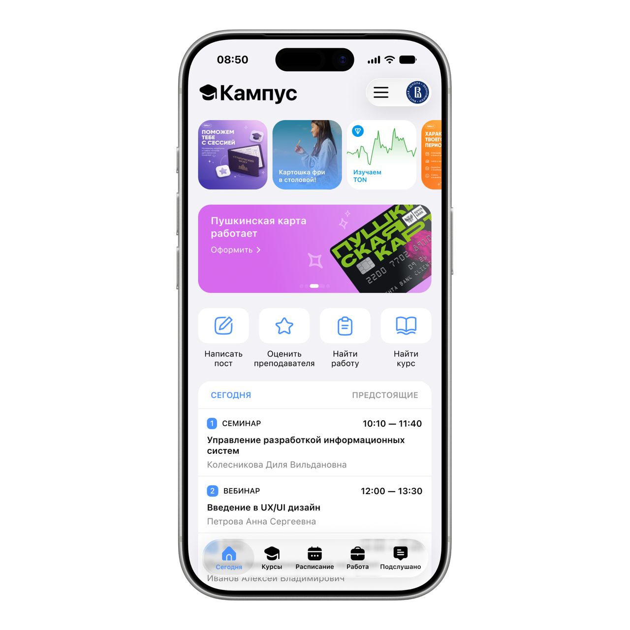
I redesigned Campus’s Today screen to connect the timetable with more of the student platform. I refreshed the UI and added four quick actions for posting, teacher reviews, jobs and courses.
- My role
- Product designer
- Scope
- Independent concept · Today screen redesign
My contribution
I independently designed the home-screen structure, refreshed the UI and added four quick actions to connect students with more of the platform.
The challenge
More than a timetable
The Campus brief described an app used mainly for its timetable, while the product was expanding into jobs, reviews, learning services and partner offers.
A broader home screen
The home screen needed to introduce these possibilities while still helping students understand their study day.
Understanding the task
Help students understand what is on their schedule and find useful things to do beyond checking it, directly from the home screen.
Starting point
I used the brief’s focus on services beyond the timetable to define four direct entry points: posting, teacher reviews, jobs and courses.
User goal
Check the study day and quickly reach a relevant action: write a post, rate a teacher, find a job or find a course.
Product goal
Introduce Campus as more than a timetable by making its services and partner offers part of the everyday home-screen experience.
Design constraints
The brief called for working within the existing design system, with new components where they logically extend it. Partner offers also needed to feel like part of the product.
Design criteria
- Keep today’s timetable and upcoming classes accessible.
- Make the four quick actions easy to recognise.
- Give useful services and partner offers clear entry points.
- Keep navigation, content and promotional blocks visually distinct.
Design decisions
A refreshed home screen
Distinct content blocks
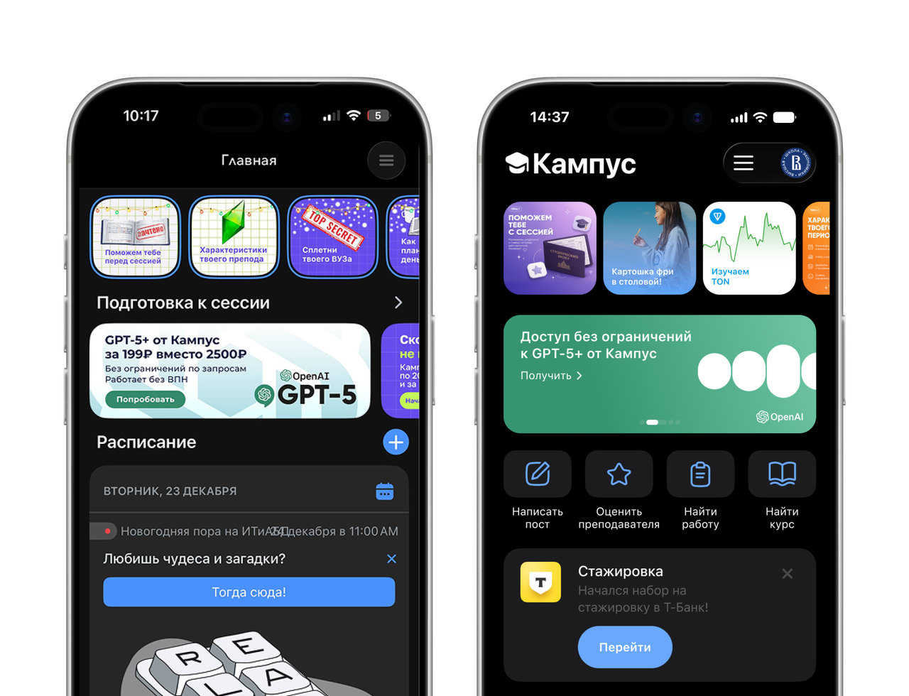
I organised stories, partner offers, quick actions, useful services and the timetable into separate blocks.
Today and what’s next
I separated the current study day from upcoming classes with Today and Upcoming tabs.
Four direct entry points
I added four shortcuts: write a post, rate a teacher, find a job and find a course. Action-based labels explain what students can do, rather than just naming a section.
Useful services and partner offers
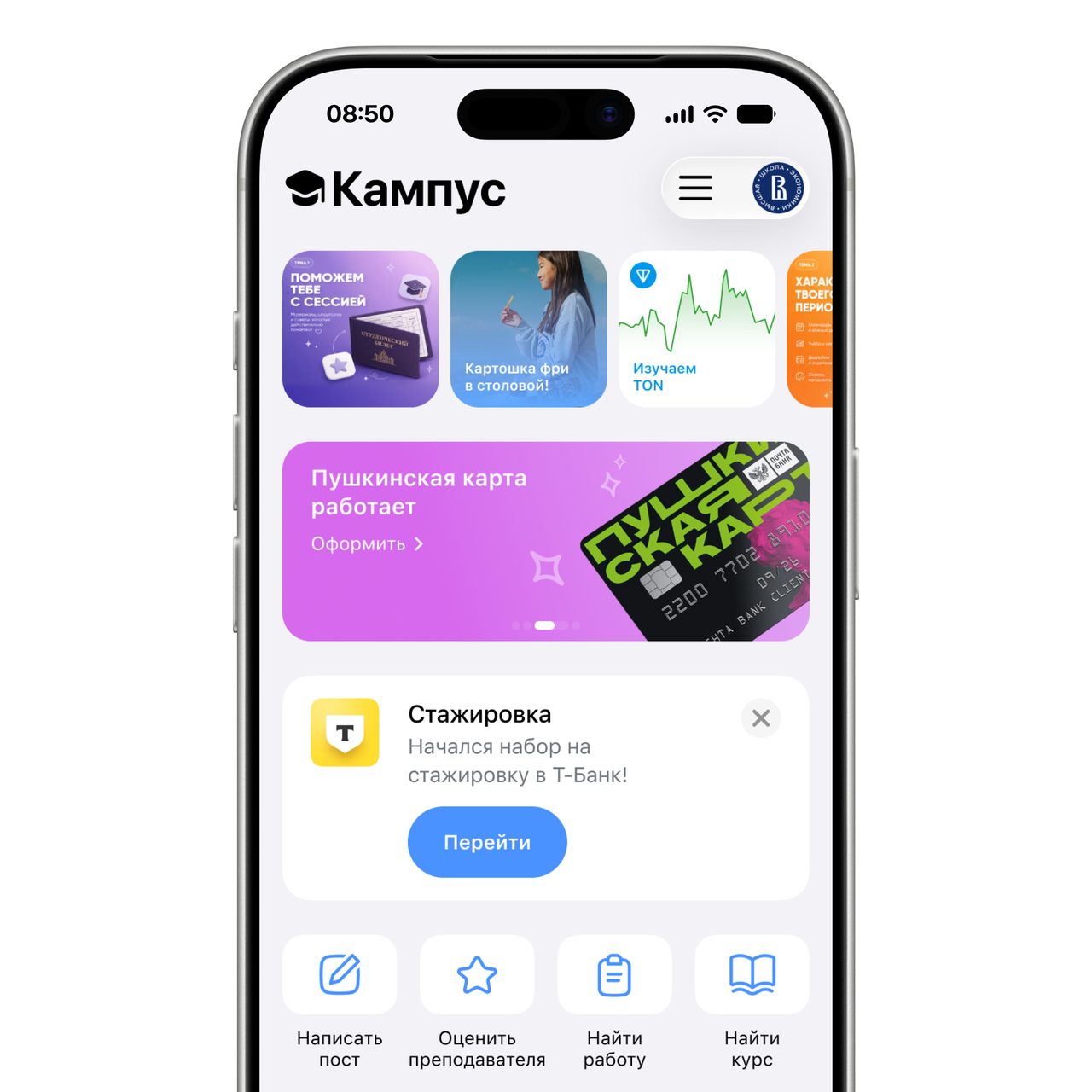
I gave partner offers and useful services their own cards with a clear next action, introducing opportunities such as a student benefit or an internship.
A way back to setup
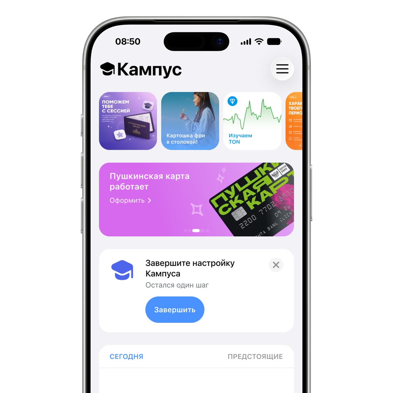
When setup is unfinished, a contextual card brings the next step onto the home screen. A short message and one action let the student return to setup without searching through the menu.
The same structure in dark mode
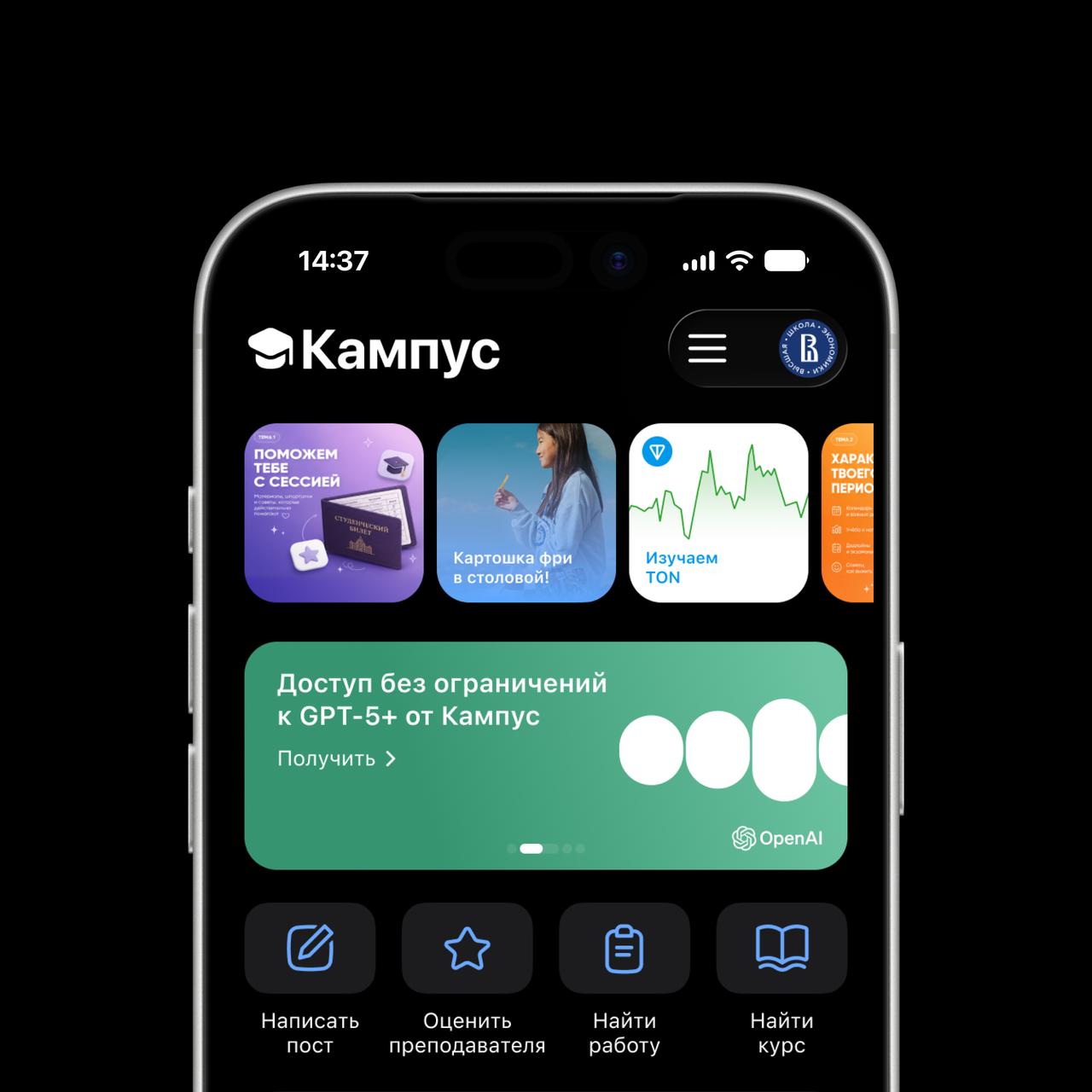
I carried the same hierarchy into the dark theme: stories, offers and quick actions keep their familiar positions, with separate surfaces for each content block.
Before / After
Before
The brief described Campus as an app used mainly for its timetable. The redesign aimed to make its broader student services more visible.
After
A refreshed Today screen brings together the timetable, four quick actions, useful services and partner offers.
Final design
A broader starting point
The redesigned home brings together the timetable, four quick actions, useful services and partner offers.
Project outcome
The result is a home-screen concept, not a measured increase in product usage.