
World Class Trainer
I redesigned the trainer workspace for iOS and Android, from discovery to release, focusing on the calendar, booking flows and session details.
- My role
- Sole product designer on the team
- Team
- Analysts, developers, managers and QA testers
I was responsible for user flows, interface design and supporting implementation, working with the team from research through release. I conducted 20+ design reviews.
Overview
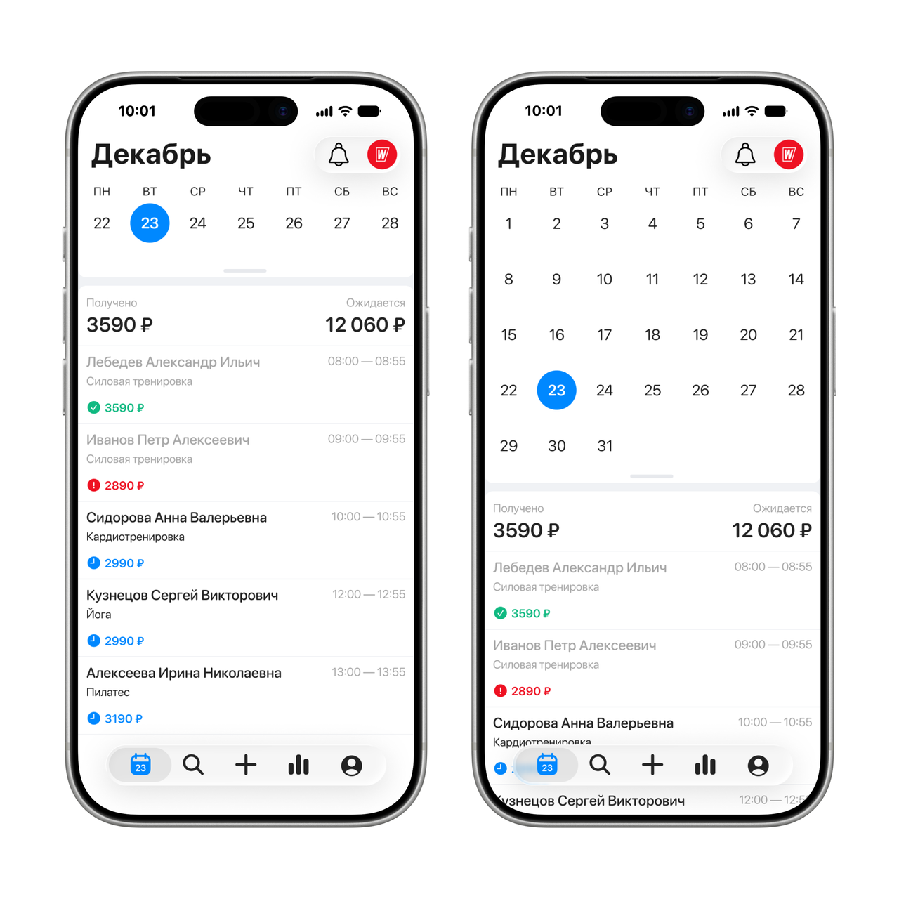
A mobile app that fitness trainers use in their daily work with clients.
- Manage their schedule and book clients.
- See whether a client is at the club.
- Manage clients’ services.
- Track progress towards revenue targets.
The challenge
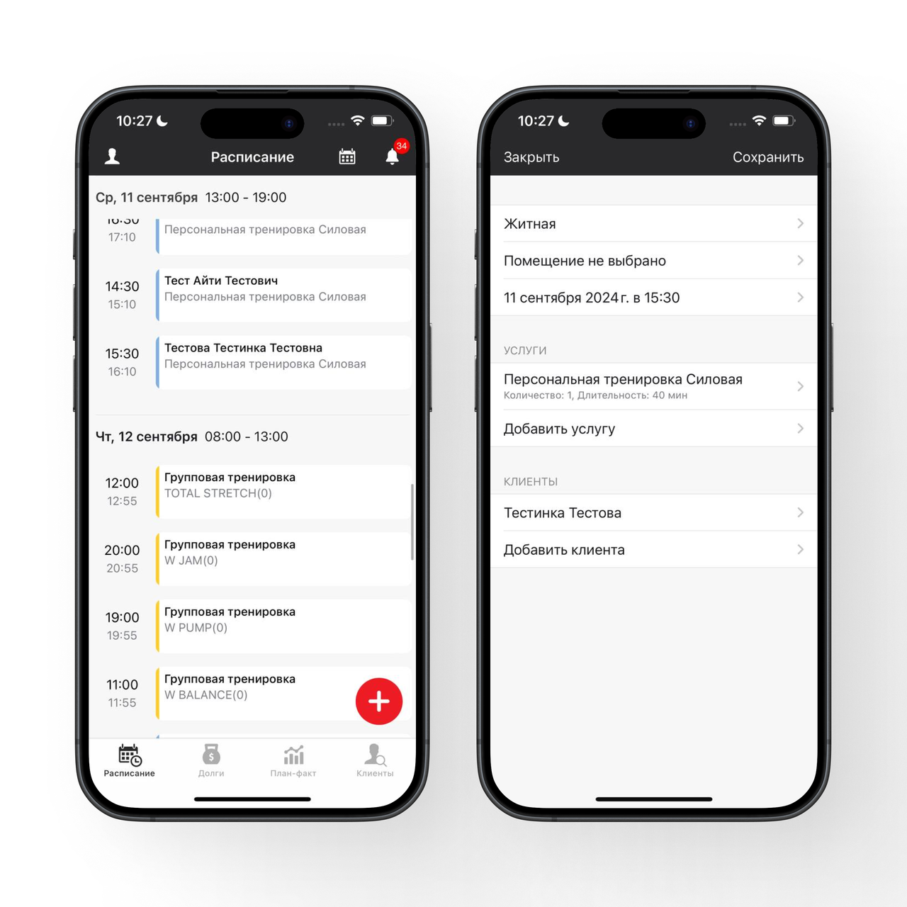
No overview of the week
Trainers had to check each day separately to understand their workload.
Information scattered across screens
Checking whether a client had arrived or paid for a session meant switching between sections.
Too many steps to book a session
One of the most frequent tasks was disconnected from the schedule and client information.
The redesign focused on three connected areas: the calendar, booking and session details.
Understanding the task
User goal
Understand and manage their workload: see the full schedule, make changes quickly and plan their working day with confidence.
Business goal
Increase the value of the mobile platform for trainers and make it their primary work tool.
Success criteria
- Engagement Rate
- Increase engagement with the platform.
- CSI
- Achieve a statistically significant increase in the platform’s customer satisfaction index.
- Time on Task
- Reduce the time needed to complete key tasks.
- Steps per Task
- Reduce the number of steps needed to complete key tasks.
Audience
Trainers actively using the mobile workspace.
Research
We conducted in-depth interviews with 50+ trainers. They revealed recurring difficulties with planning, booking and finding client information. Financial figures were also scattered across sections, and some had to be calculated manually.
We tested the proposed flows in moderated usability sessions. The findings informed two key defaults: a weekly calendar view and an expanded picker in the booking flow.
Design decisions
Calendar
Before
The schedule was a long list of sessions. Trainers had to scroll from Monday to Sunday to understand their weekly workload.
After
I designed a calendar that switches between week and month views while keeping the selected day’s schedule visible.
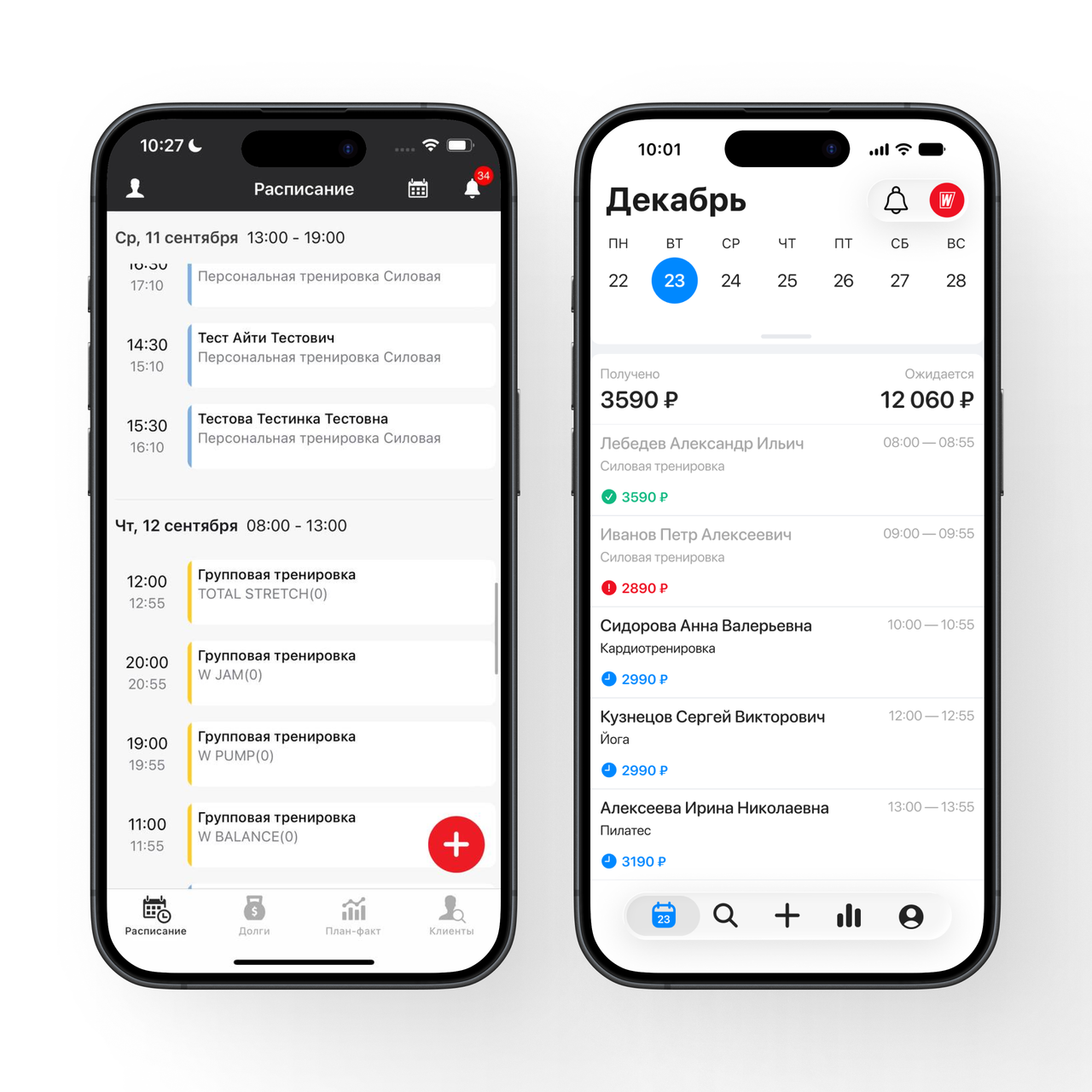
In moderated tests, the weekly view worked best for everyday planning, so I made it the default.
Booking a session
Before
Creating a session was split across several steps. Event types and the picker opened separately, and trainers could not switch between a session and a shift within the flow.
After
I moved creation to the tab bar, making it available from any section. I removed an extra step, combined sessions and shifts in one flow, and embedded the picker in the sheet, expanded by default.
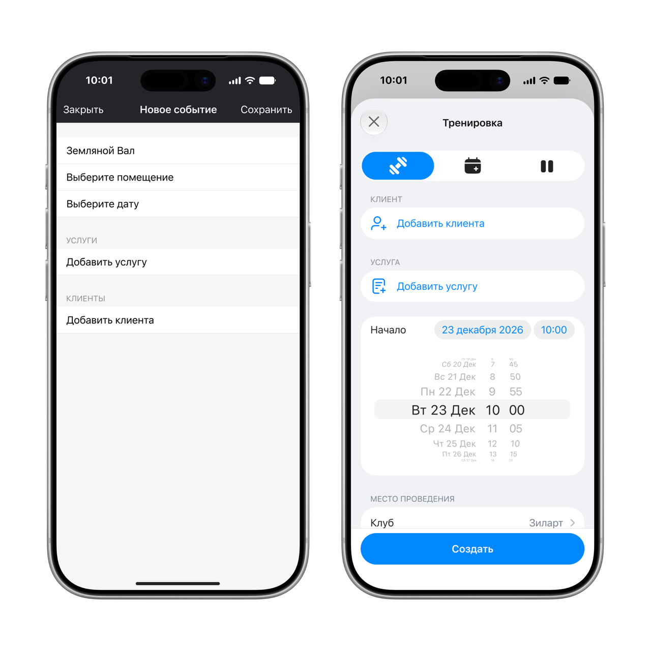
Moderated tests showed that the expanded picker was easier to use, so I kept it open by default.
Session details
Before
The session screen repeated the creation form. It did not show payment status or whether the client was at the club.
After
I brought payment and club-presence statuses into the session screen and added a toolbar for session actions.
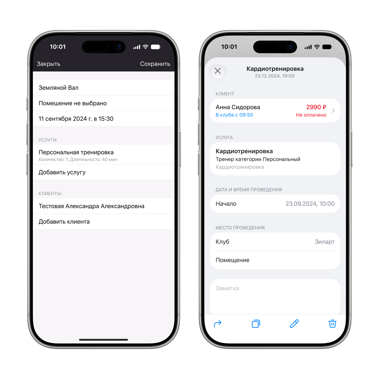
Trainers can check payment and attendance in the context of the session, without switching between sections.
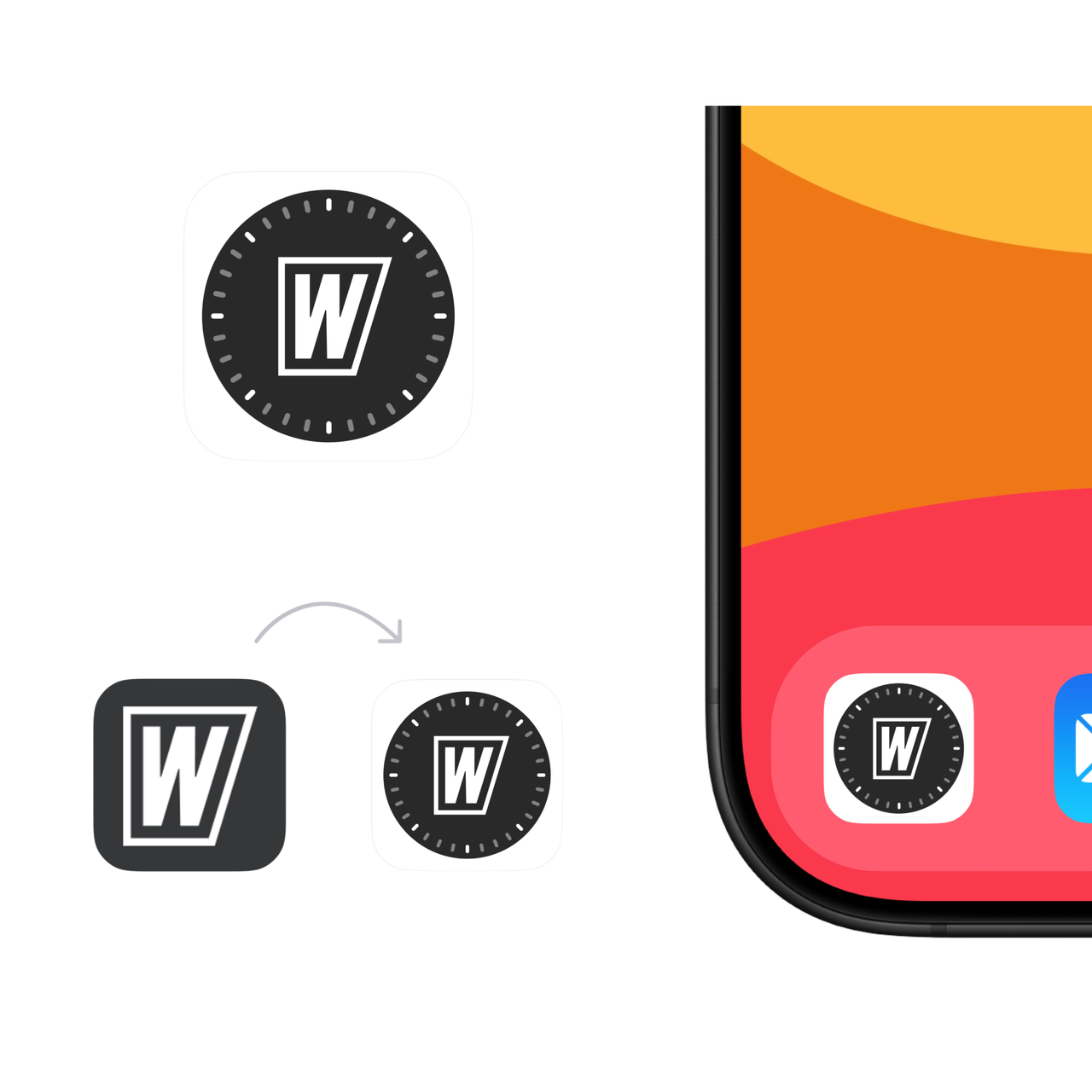
App icon
After launch
All the solutions shown here shipped in the release.
- Calendar CSI
- Increased by 16% compared with the previous schedule screen.
- Time on Task
- Key tasks took substantially less time to complete.
- Steps per Task
- The number of steps needed to complete key tasks was substantially reduced.